When you're designing in Glide, everything is a Screen, and every Screen has Components on it. Components display and let your users interact with your data in powerful ways.
Some Components like Collections show multiple rows of data, while others like Action Row display only a single value.
You can always see which Components are on a screen in the Components panel on the left.
Some screens may limit you from adding new components, but most screens let you add Components wherever you like.
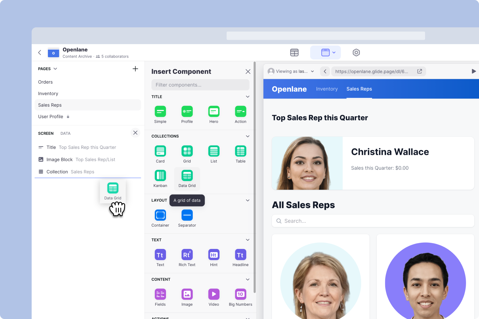
Dragging a new component into the Screen Panel will add it to your screen
To edit Components, click one on the left, and configure the component's settings on the right.
.png)
Clicking on a component in the **Screen Panel** will open its configuration settings on the right
Configuring Components
Some Components are very simple, while others are much more complex. However, most Components have one or more of the following areas in their settings.
- Data
- Design
- Action
- Options
Data
Data (sometimes called 'Content' or 'Items Data') is where you configure what the Component is displaying. Some Components can only display a single value from your data, and others let you show multiple properties.
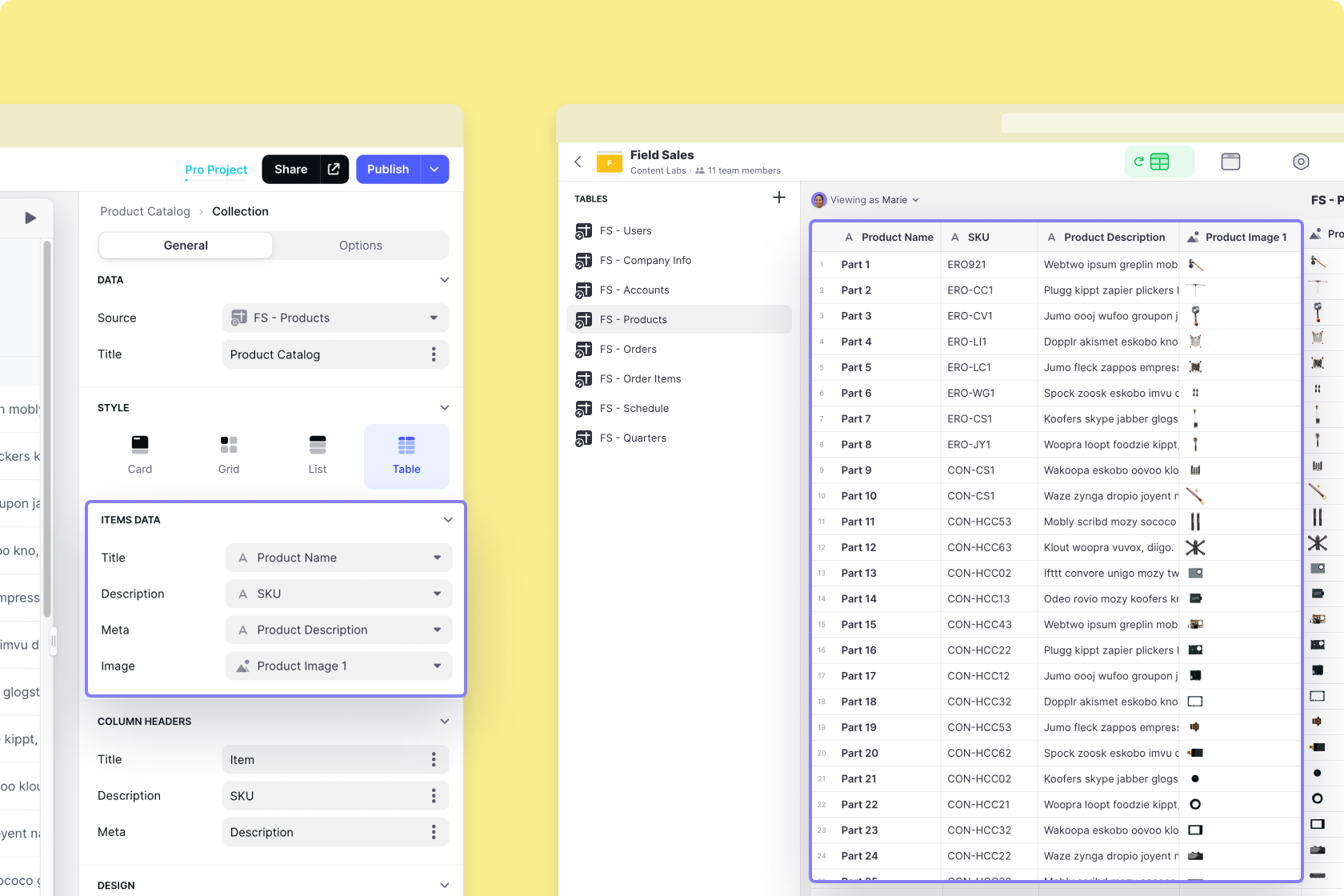
The configuration for the Collection Component (on the left) can show four columns from your table (right)
Design
Design lets you tweak a Component to style it how you like. With Lists and Collections, the settings here can be quite extensive. But with simple Components like the Text Component, the settings are very minimal.
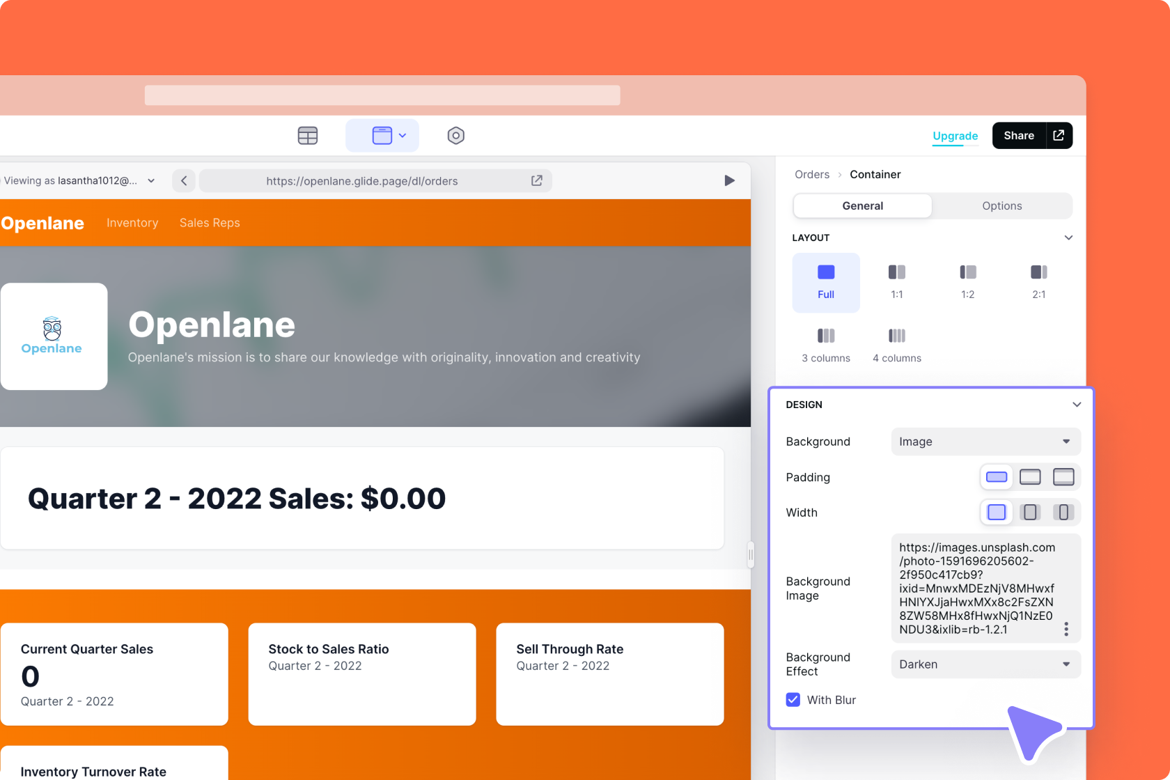
Configuring the design options in the Container Component
Action
Many Components have the option to add Actions. Sometimes you can add only a single action and sometimes you can add many.
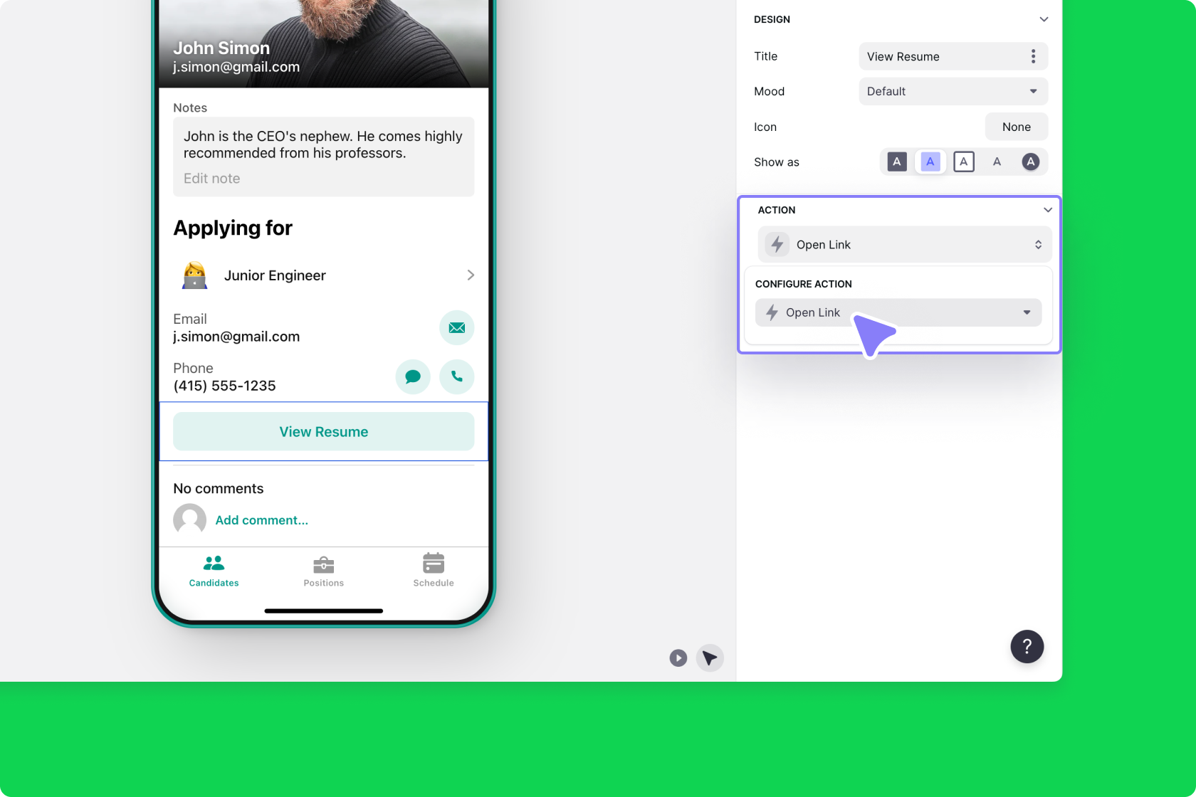
The Action settings in the Button Component's configuration panel
Options
Most Components have only two sections: The General tab and the Options tab. Most Components have only Visibility settings here, but Lists & Collections have many other options.
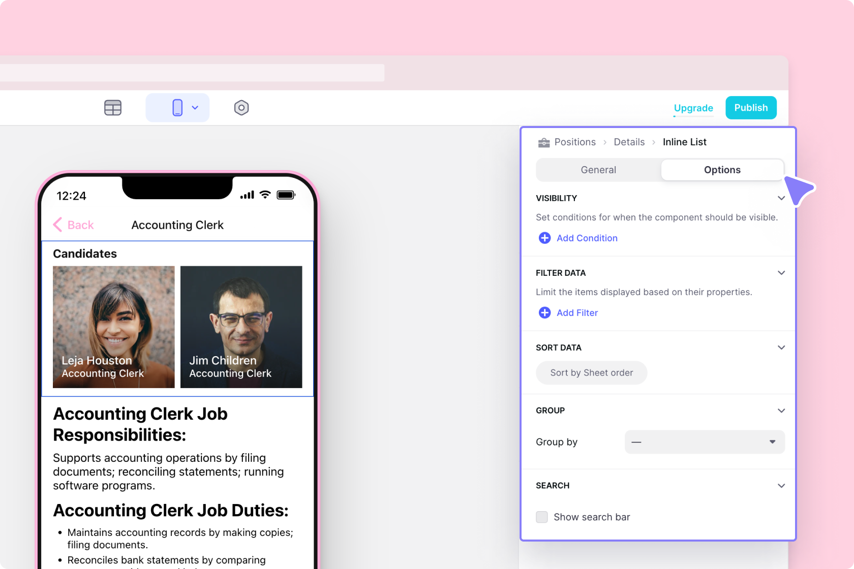
The Options tab within a component's configuration
Editing Components
Deleting
When you delete Components, they don't affect the data in your table. If you accidentally delete a Component, you can hit Command Z (Mac) or Control Z (PC) to bring it back. This also works for many of the other Actions you take while building your app. Alternatively, you can click the Undo or Redo buttons in the bottom left of your screen.
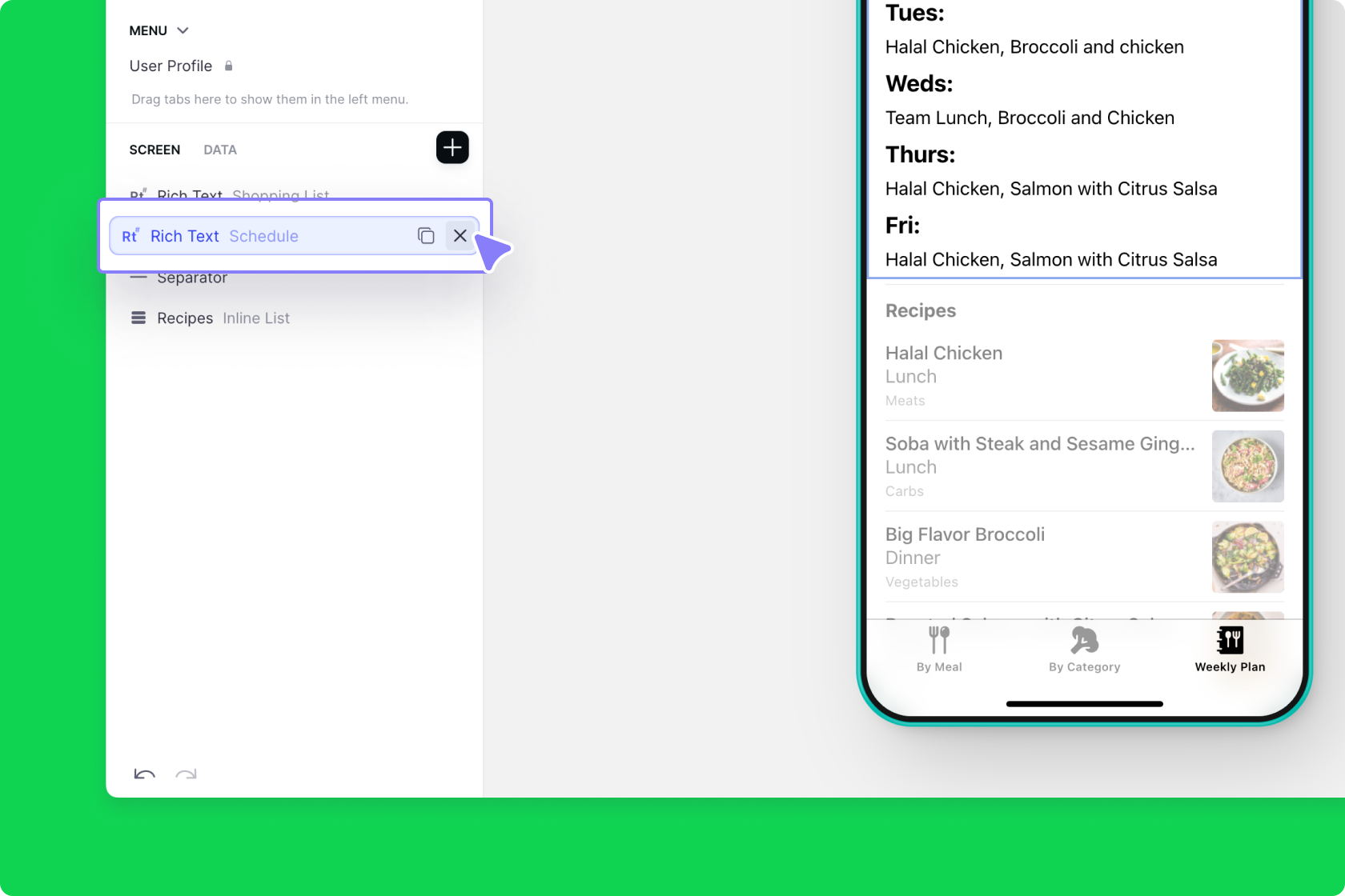
Deleting a Rich Text component