In our core guide on Data to Layout — we said that ‘Tables become Tabs'. This is, in fact, a bit of a simplification.
Every tab has a top-level screen — which is often a List Screen, but it can also be a Details Screen. It's better to think of Tabs as windows through which you can visit many screens.
When you're building simple Apps, you don't need to think too much about what type of screen you're on. Observing how the components panel changes when you move from screen to screen will help you orient yourself.
But when you're building more complex projects, it's important to know all the different types of screens and how they relate to your data.
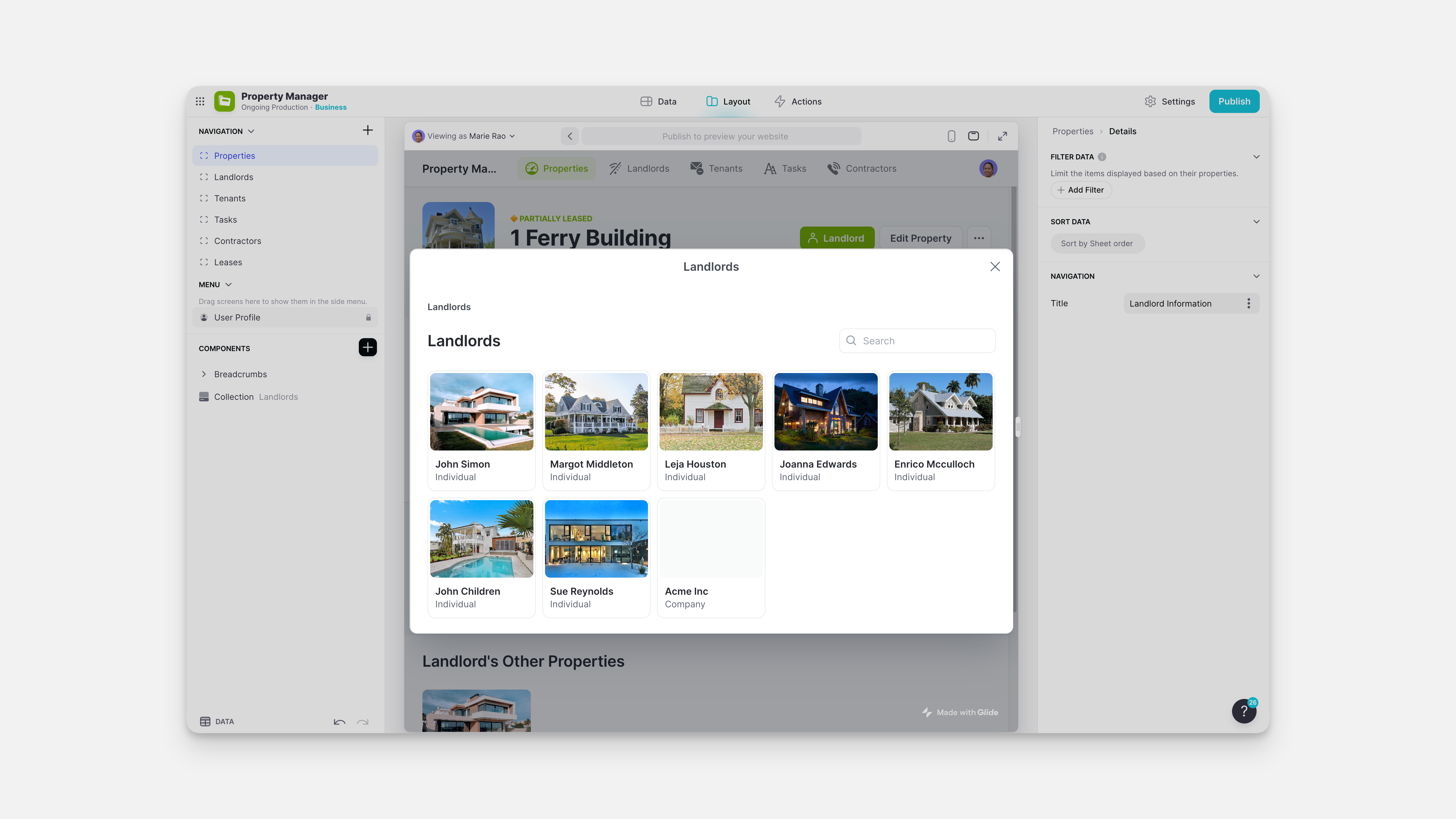
Collection Screen
When you create a new tab and choose a table with multiple rows, Glide will choose a Collection Screen layout. A Collection Screen is a top-level screen that shows all the rows in your table, and you can choose between different list styles.
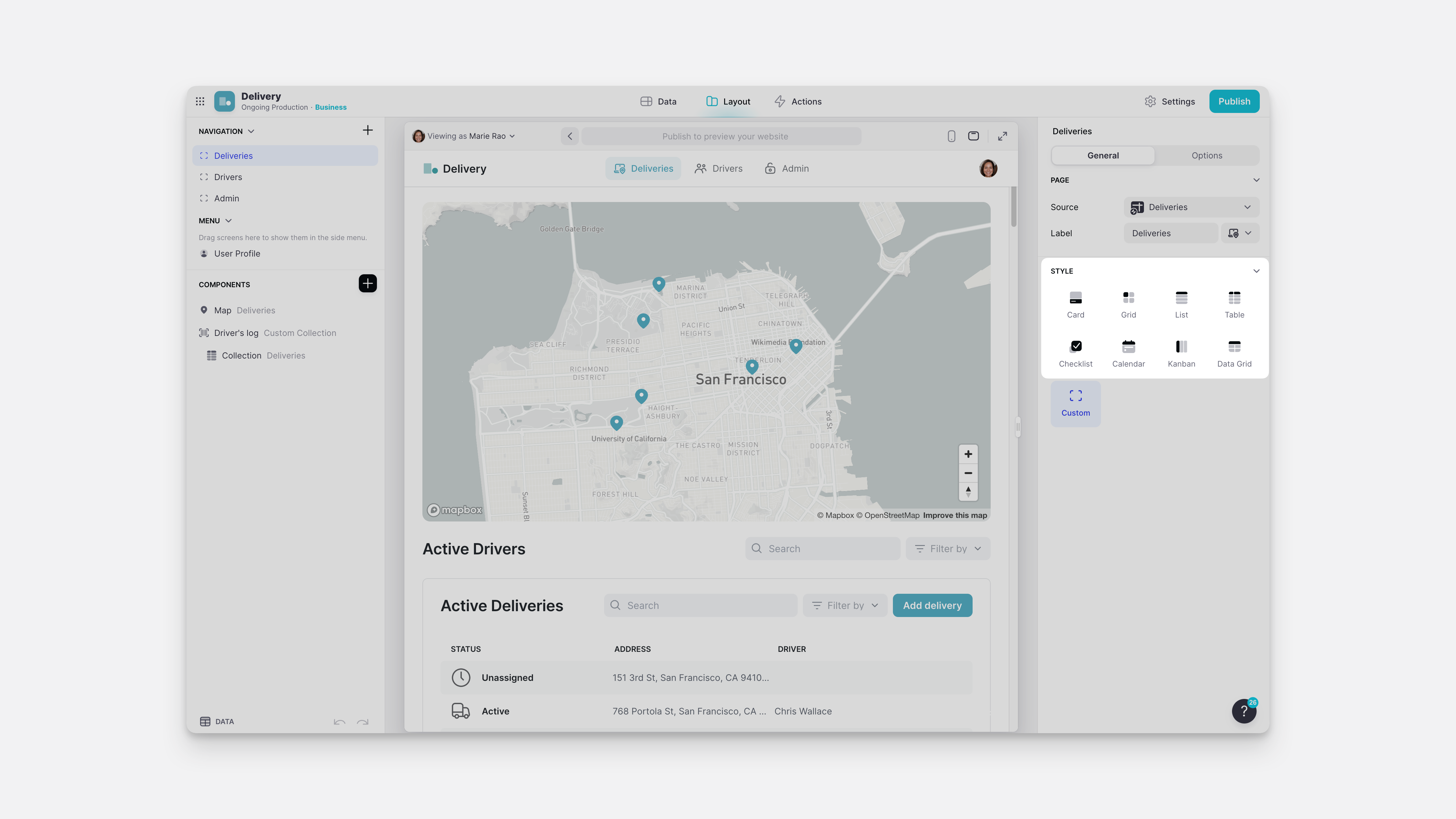
On a Collection Screen, the components panel on the left shows a single Collection component.
Custom Screen
The other type of top-level screen you can have for a tab is a Custom Screen. A custom screen can have as many components as you like, as opposed to a Collection Screen, which can only have a Collection. (Click and zoom in on the image below to see this comparison clearly)
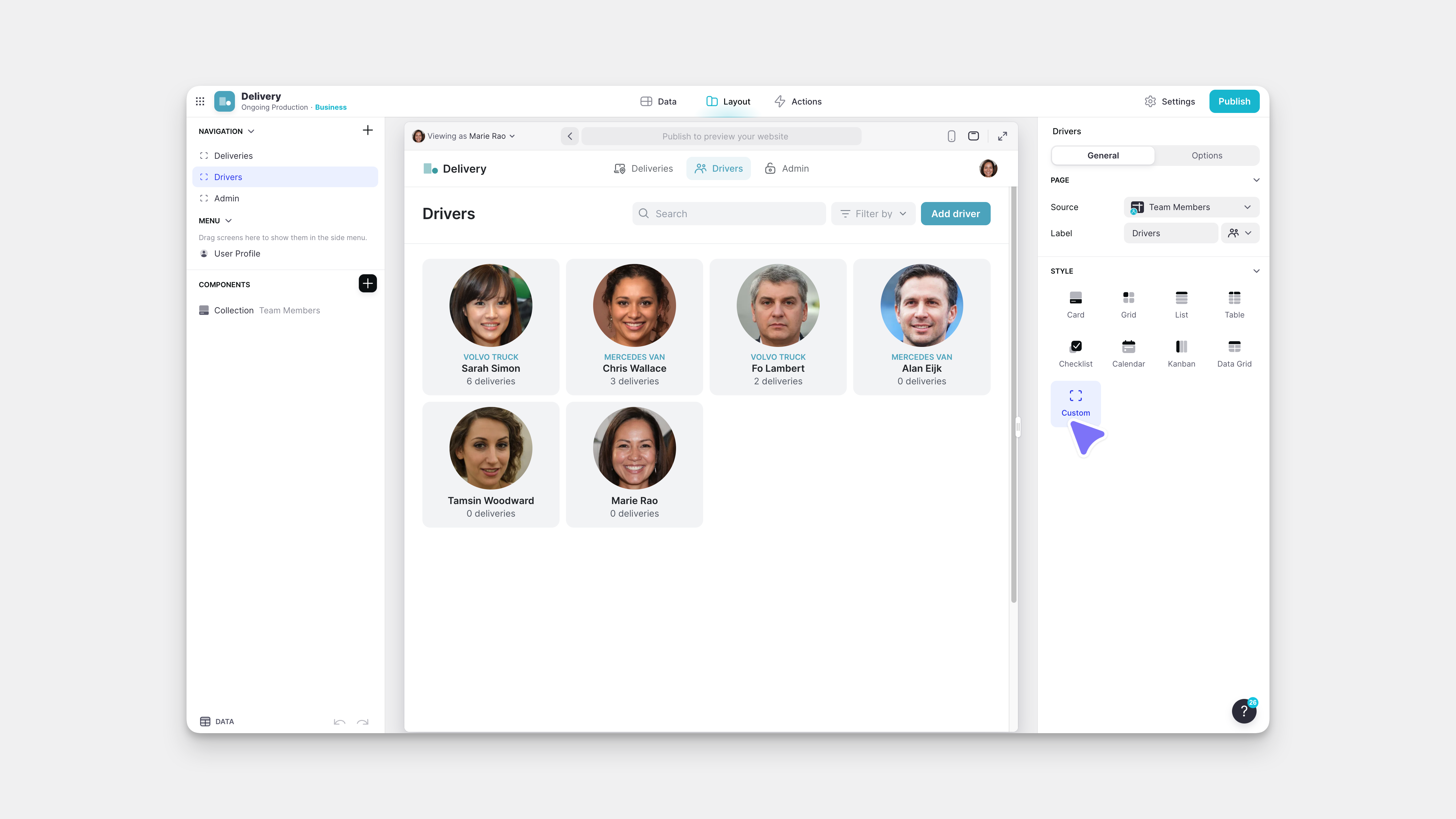
If you switch a Tab from a Collection Screen to a Custom Layout, the Collection will remain, but you will be able to add other components.
Similarly, if you add Components to a Collection Screen, the layout will change to a Custom Layout automatically.
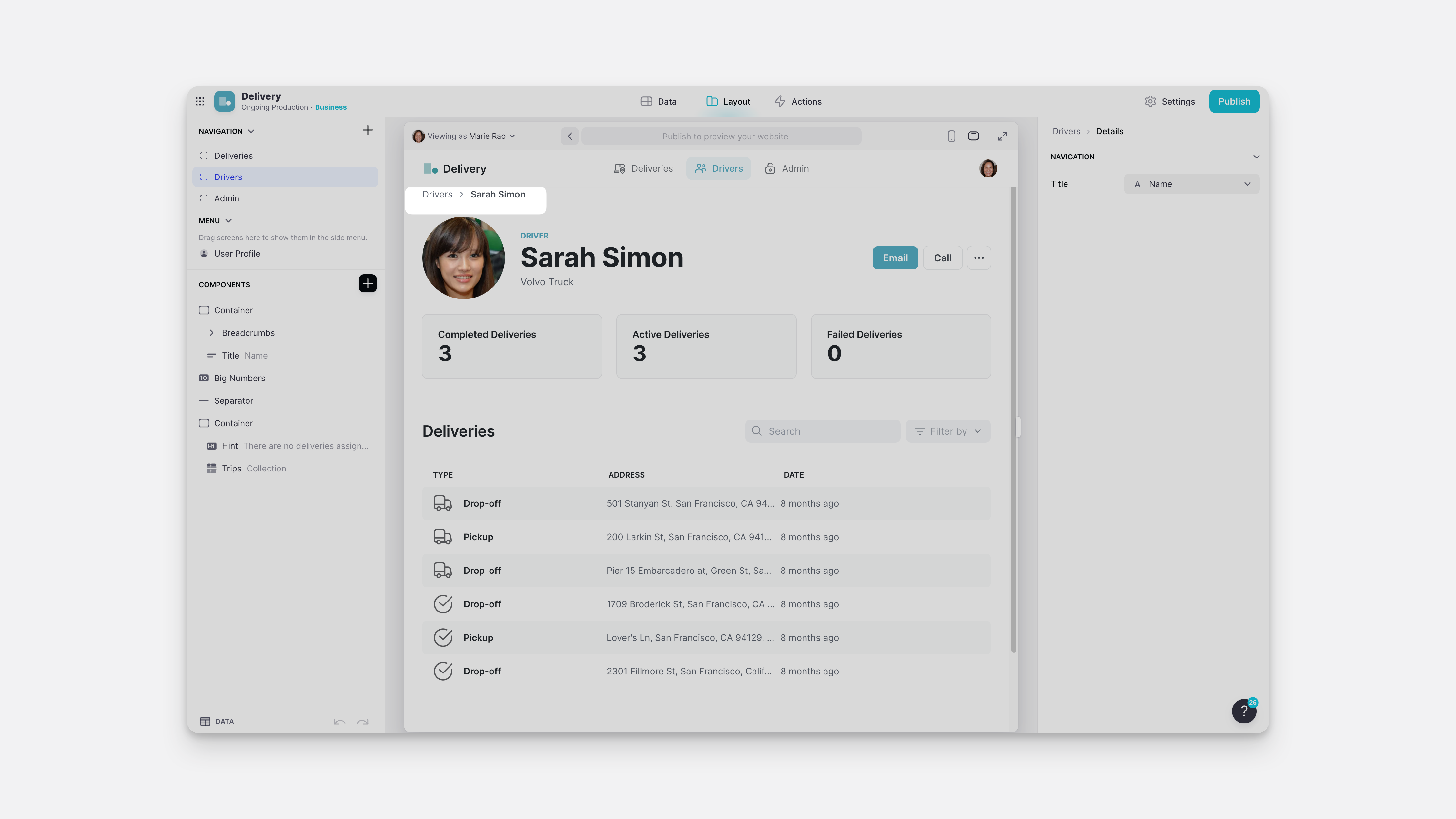
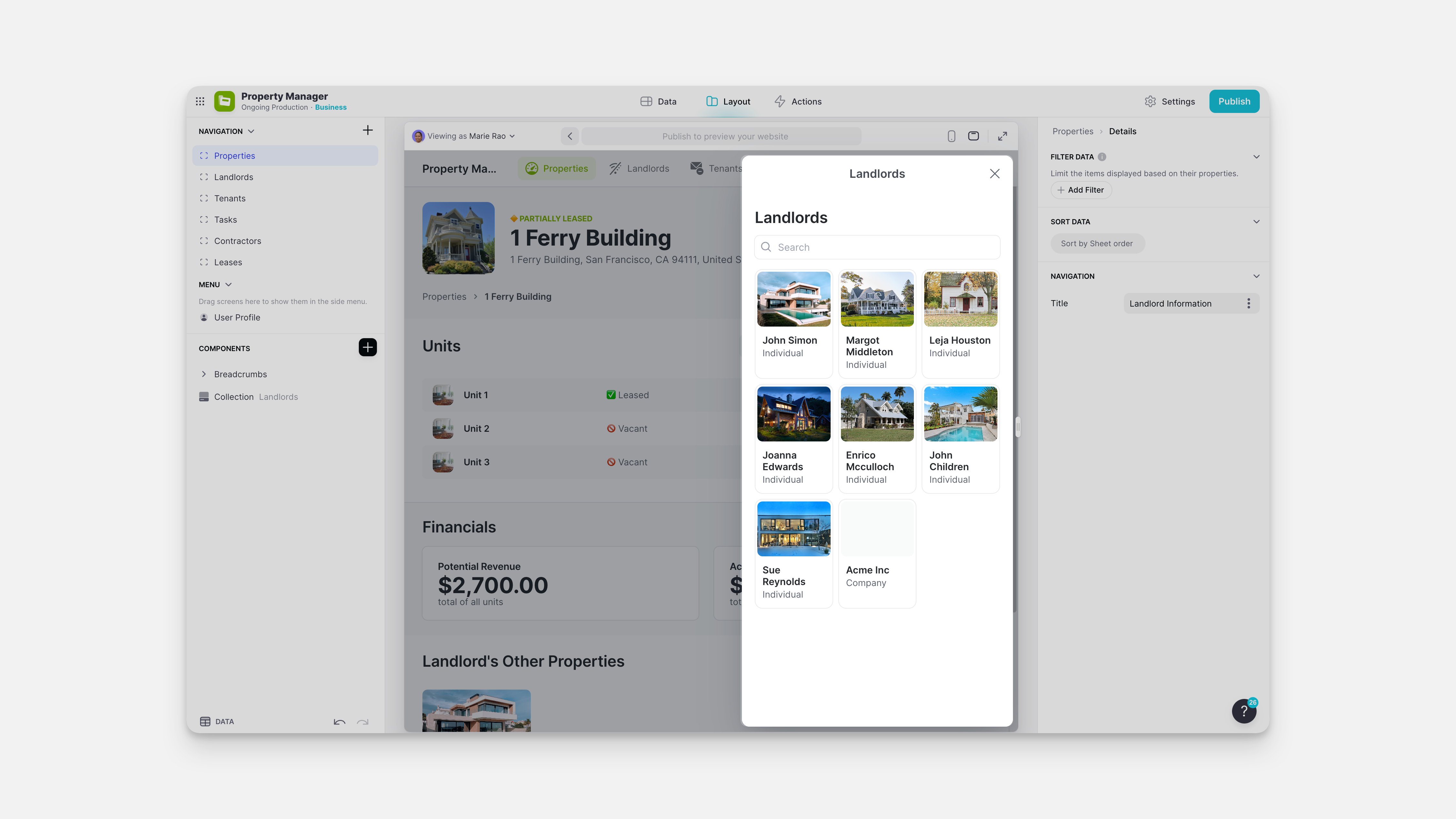
Details Screen
When you click on a Collection Item, you get taken to that item's Details Screen. A Details Screen represents an entire row, whereas a Collection Screen represents the entire table.
Details screens are like Custom Screens in that you can add multiple components to them, but they are sub-pages. They are not at the top level of your tab. You can see this reflected in the breadcrumb navigation in Glide and the Breadcrumb Component if you have it added on a Page.
New Screen Templates
In Pages, the New Tab menu has pre-built Screens you can add to your project.
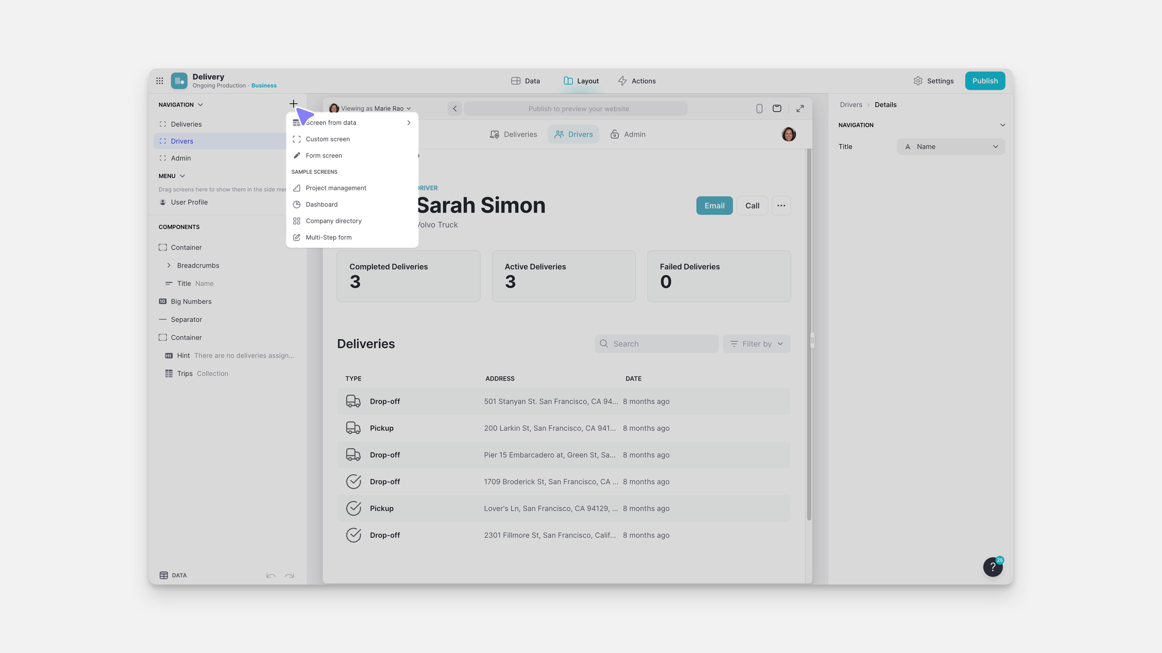
Most of these will create a Custom Screen that has pre-configured components and also add the necessary pre-built Glide Tables to the Data Editor.
This is a really easy way of creating forms and other screen types. However, you may also want to add a component that triggers a form screen with an action.
Form Screen Action
For example, say you're working on a Property Manager project, and on the details screen of a property, you want a button called ‘Log Issue.' This will trigger a new form screen that will submit a new issue to the Issues table. You can add a button to that screen and assign the Show Form screen action.
When you add the form screen action, you configure which table it will populate.
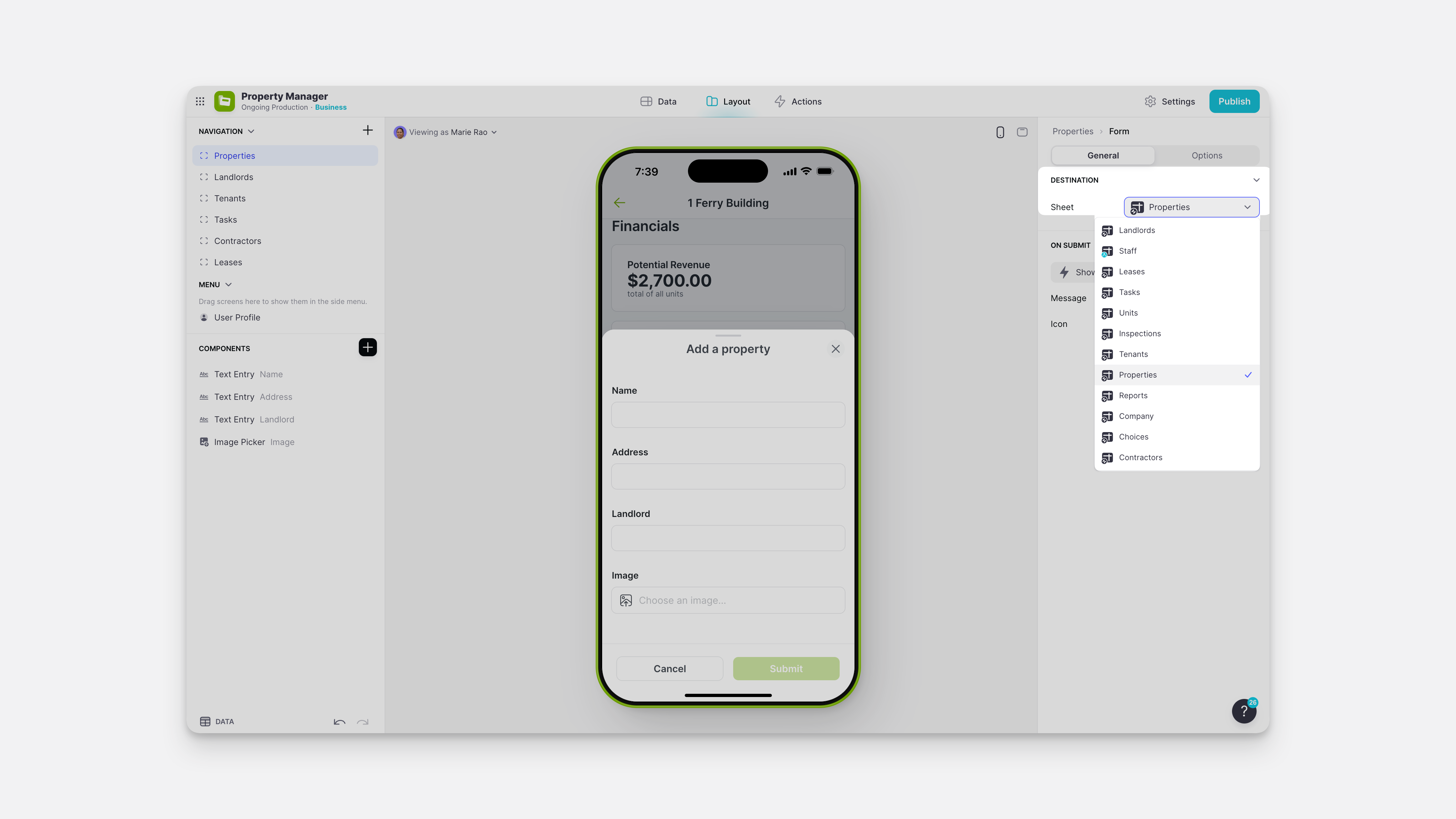
When you open that form screen, you can add fields that map to the columns of that table. As always, Glide will add all of these for you, but you can customize this screen however you like.
Edit Screen Action
You can enable add and edit screens or delete items simply in Pages by toggling the switches in a collection.
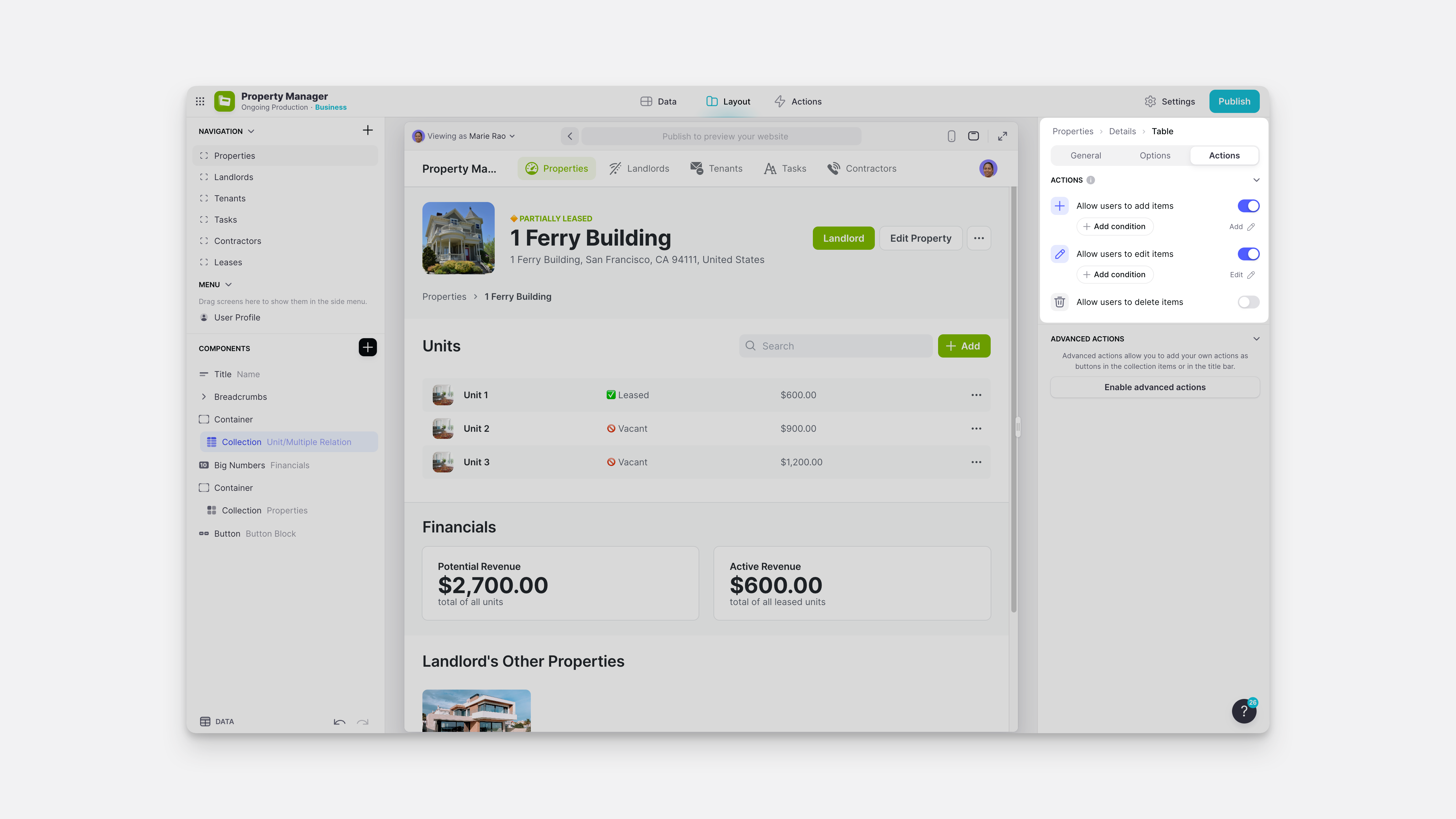
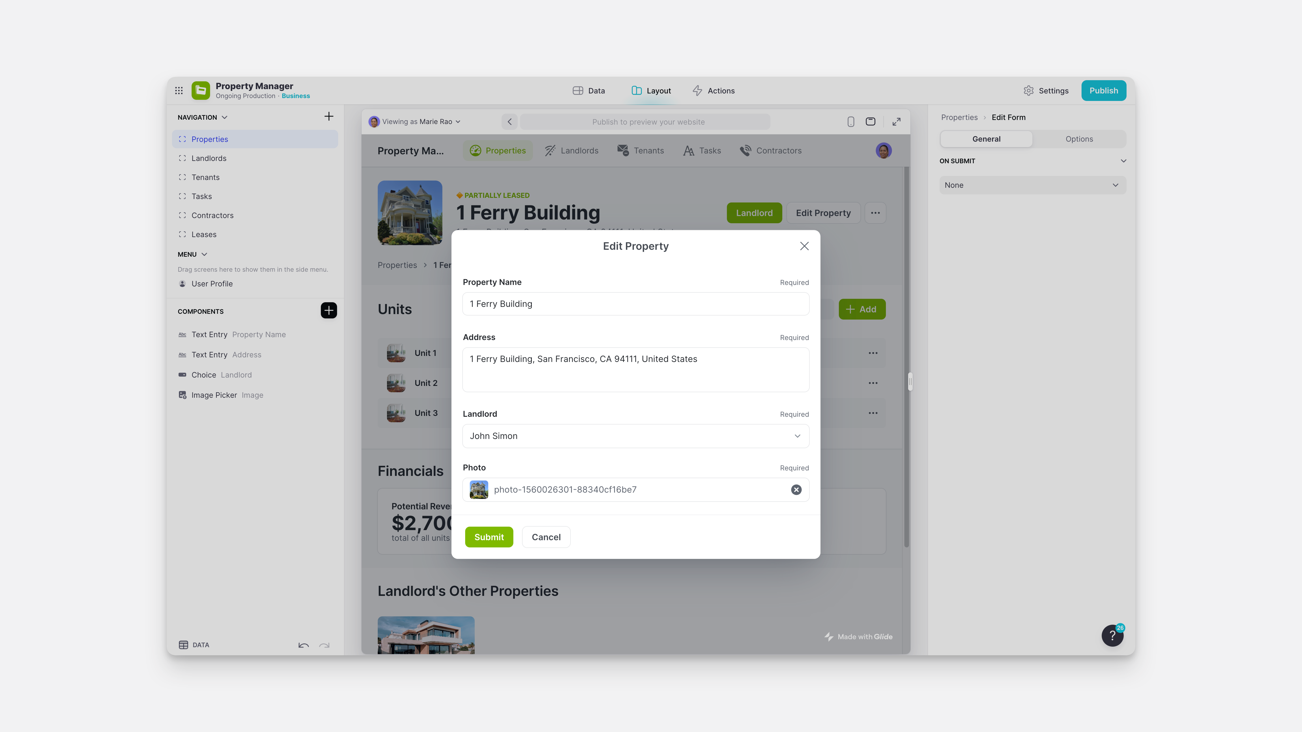
However, you can also configure other components with the Edit Screen action to trigger an edit screen.
Targets
Often, a new screen will pop out and display over the main content you're working with. In Glide, this is called an Overlay or Slide In.
By default, Details Screen opens in Current, and Edit Screen opens in overlays in Pages. But you can change this behavior.
Whether your action is Show Details, Show Form Screen, or Show Edit Screen – in the action configuration, you'll see four options for the ‘Target': Current, Main, Overlay, and Slide In.
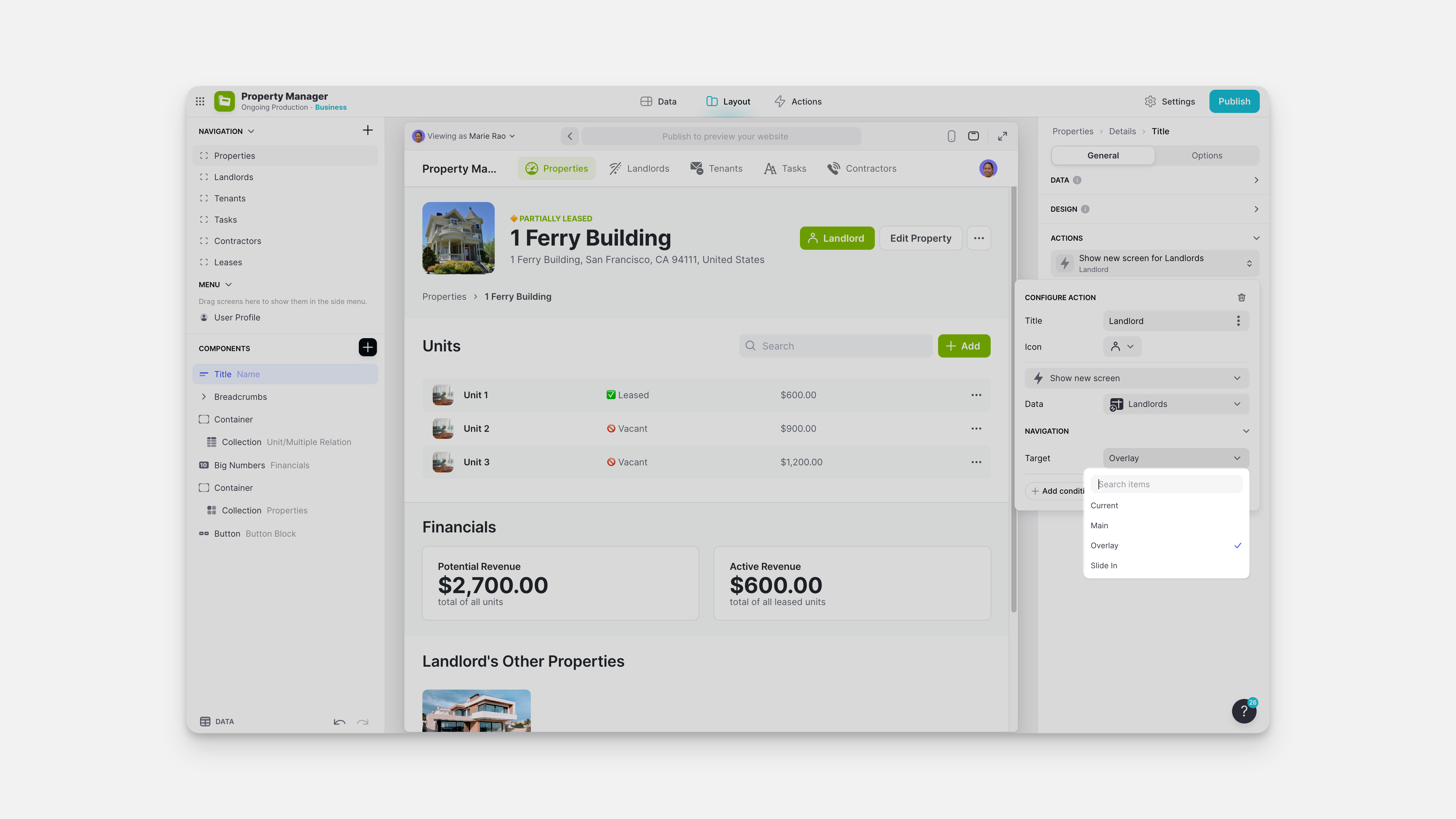
Overlay
Overlay will open the new screen as a pop-up in the center of your screen. On mobile, the overlay covers the entire screen.
Slide In
With the Slide In target style, content can slide in from the right on desktop, or slide up from the bottom on mobile.
Current
Current replaces the current screen with the new screen. For example;
- If the current screen is an overlay, and you trigger an open screen action like Show Form Screen — then the overlay will change to show that new Form Screen.
- If the current screen is the main screen (not an overlay), and you trigger an open screen action like Show Form Screen, — then the new screen will replace that main screen.
Main
Main replaces the main screen with the new screen. For example;
- If the current screen is an overlay, and you trigger an open screen action like Show Form Screen, then the overlay will close, and the main screen (the screen behind the overlay) will be replaced by the new form screen.
- If the current screen is the main screen (not an overlay), and you trigger an open screen action like Show Form Screen, then the main screen will be replaced by the new form screen.
User Profile Screen
The user profile screen is a details screen showing a row in the user profile's table. You can configure it exactly like a normal details screen. This screen can be accessed by the user by clicking on their profile image or triggered by the Show User Profile Screen action.
Other Screens
There are lots of other new screens that appear, but they don't have components on them and are therefore not configurable in the same way. They are:
- Open link opens a web browser
- The Event Picker component opens its own full-screen calendar
- The sign-in screen is where people sign into and out of the app.